Friday, December 17, 2010

Final project

Thanks to the army hat design I had to do a while ago, I remembered how to give the glass the apperance that it has now, with the reflection, and the glass itself. I only used the christmas tree tutorial, nothing else.

Here is the pattern that I used in the photo, with everything else hidden. I think it is what we were supposed to do anyway.

Last of all, here is my pattern that I used on the wall, before it was scaled or colored. I really only used the given, and slightly defalt brush.
SEE YOU NEXT YEAR KLEIN
HAD FUN
MERRY CHRISTMAS
AND
HAPPY NEW YEAR
Tuesday, November 16, 2010

Buisness Card


Here is the buisness card, not really sure if I am supposed to post it, so I am. Anyway, I thought it best to add a couple turtles, that way you know what Le Tortue means (TORTOISE). I also added the origonal turtle inside the LT, just for the heck of it. This is my 3rd post today, and I probably have a few more to go so I will wrap it up there. Thnx ppl xD

Cate Logo

I got the basic idea from a brand called Sharp Edge, so I thought it was cool so I tried to use it to the best of my ability for this cate logo. The rest was just my version alone.

Pattern Creation

Mostly straight forward, not much to say... so... here you go. xD

Friday, November 5, 2010

Le Tortue logo


about time I got this done, it took me about a week of trial and error. The smaller one looks a bit different because it doesn't scale the inner glow (I will try to fix it). [FIXED]. I ended up trying to use 7 or so different turtles, but none of them would work very well. This is actually 1 of 14 different edits, yeah, it took a while, but after a little photoshop, a lot of angles, and tons of looks and appearances, I am sticking with this one.
PLEASE RATE WELL!!
:)

Tuesday, October 26, 2010

Personal project

It just so happened that im my other class, DIM, I needed pictures of myself. So I got to start on mine right away. I chose blue because it is a smoother, calmer color. I kept it mostly horosontal because it is a more stable angle that gives support. As well as all of the colors for the words were all on the grayscale, because it was easier to see on the blue gradient background. I also made the gradient a radial because circles give a tranquil feeling, and it also gave a look as if it were radiating from the head, bringing atention to the face. The words surrounding my face were also to give the face a different feeling than the rest of the picture. The shirt words were only because I ran out of room on the picture, so I decided to try and make it look as if it were on the shirt itself. But as you can tell, I like games, sense 8 of my words have to do with video games.
THNX PPL
 RATE WELL
xD

Thursday, October 21, 2010

Personal 3D Project (Army Hat)

I must say I DO NOT RECOMEND THIS PROJECT TO ANYONE! It takes a SUPER long time to finnish along with learning how to use the mesh tool. Not super fun. But none the less I finnished and I am proud of it.
RATE WELL PLZ!
&
PLZ COMMENT!
 thnx =)

Friday, October 15, 2010

Vase w/ Flower

Decided to go ahead and add in the flower, but making it 3-D was SUPER anoying! I finally just chose the 3-D effect "Rotate". That gave it about as real of a look as possible. Hope you like it.

Thursday, October 14, 2010

Flower

Tried to make it look as much like the one in the demo as possible, not going to be super origonal.

Thursday, October 7, 2010

Hey there people! Thought you might want some more content from me. So I am back with the same project as every one of you! I just kind of wish that I could have been able to use the same text for the SNOWBOARD line, but what can you do. Anyway, here is my take on the snowboard project. Hope you rate me acordingly! Thanks again people.
-Ryan "THE NINJA" Jones

Thursday, September 30, 2010

FALLOUT SIGN


The first is the one I created, the second was the original. It took about 30-45 minutes. I used the gradient on the black areas to replicate the fallout sign (which took a long time to find the color that would work). As well as making the whole thing slightly crooked, leaning slightly to the left. For the three triangles I used the pen tool because I couldn't find a triangle tool (comment me if you know how to find one, if there isn't one, tell me that too because I couldn't find it). Thanks for reading! :)

WHAT HAPPENS ON THE VEGAS SIGN, STAYS ON THE VEGAS SIGN

I actually found the exact letters they used on the WELCOME part, even though it is not named the same. They said  Helvetica, but I found it called Raavi. I was kind of excited when I found it (not really).

Tuesday, September 28, 2010

Spiral text

I slowly reduced the text by large numbers at first then slowly decreased the size by the end.

Friday, September 24, 2010

BLUE TEAM


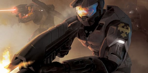
I used made mine pretty simple. To make the splat marks go better with the text, I rotated the lower marks to move and flow with the text, and give a sense of depth. As well as when I put the splat on the text, I made it so that it would overlap to make it into one continous spray. I got blue team from a show that I watch called
Red vs. Blue.

Tuesday, September 14, 2010

Text MONSTER!!

For my ninja picture, I googled cartoon ninja, then put it on the background while putting boxes on top of it, just to give it shape. After the boxes I just slowly put green letters on the black boxes to give me an idea of where everything was. Then I removed the boxes and colored the person acording to the picture.
!!TEXT NINJA!!

Thursday, September 9, 2010

mega, uber, awesome ░QUOTE░

If you had ever watched mythbusters, you would understand it.
If not let me explain, any result, weither right or wrong, is a result, and gives answer.

Has an asymmetrical balance, where the word failure is pinned on to the top left. Making it differ on both sides. Has an alternating rhythm of the black on red, and red on black. Main point of emphasis is the word failure. For it has red in the middle of dark area.

Thursday, September 2, 2010

Elements of Design


This picture signifies movement because of the diagonal angle of the person, as well as contrasting colors on opposite sides. It also has the texture in the background of being the NBA logo many times over. As well as using brighter colors to grab attention.

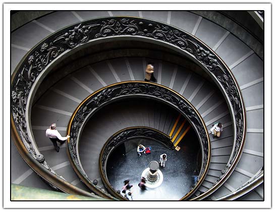
The staircase circular which gives it serenity and makes you think of infinity. Also giving you a calming feeling. 
This photograph has sharp, jagged angles and gives off a vibe of excitement and confusion.
This picture has balance and stability in it, it is also a small image in a large space so that your eye goes to some of the blank or empty spaces in the image. It also uses mostly lighter colors along with a dark section. The bottom section has a liquid texture to it to feel flowing.

Wednesday, August 25, 2010

About the Creator

      My name is Ryan Jones, and I am a freshman. I have a family of four. (father, mother, and sister) Along with my dog Coco. I play the guitar, but spend most of my time playing on my Xbox. We live in a 2 story, 4 bedroom house. My room is on the seccond floor, where I spend most of my time. Over the past few summers I have been earning money for things in my room. I have earned and speant over $5,000 in 4 years. With it I have bought a 50" TV, a Mac laptop, many games, and my Xbox. I look forward to having more posts on the blog.