Thursday, September 30, 2010

FALLOUT SIGN


The first is the one I created, the second was the original. It took about 30-45 minutes. I used the gradient on the black areas to replicate the fallout sign (which took a long time to find the color that would work). As well as making the whole thing slightly crooked, leaning slightly to the left. For the three triangles I used the pen tool because I couldn't find a triangle tool (comment me if you know how to find one, if there isn't one, tell me that too because I couldn't find it). Thanks for reading! :)

WHAT HAPPENS ON THE VEGAS SIGN, STAYS ON THE VEGAS SIGN

I actually found the exact letters they used on the WELCOME part, even though it is not named the same. They said  Helvetica, but I found it called Raavi. I was kind of excited when I found it (not really).

Tuesday, September 28, 2010

Spiral text

I slowly reduced the text by large numbers at first then slowly decreased the size by the end.

Friday, September 24, 2010

BLUE TEAM


I used made mine pretty simple. To make the splat marks go better with the text, I rotated the lower marks to move and flow with the text, and give a sense of depth. As well as when I put the splat on the text, I made it so that it would overlap to make it into one continous spray. I got blue team from a show that I watch called
Red vs. Blue.

Tuesday, September 14, 2010

Text MONSTER!!

For my ninja picture, I googled cartoon ninja, then put it on the background while putting boxes on top of it, just to give it shape. After the boxes I just slowly put green letters on the black boxes to give me an idea of where everything was. Then I removed the boxes and colored the person acording to the picture.
!!TEXT NINJA!!

Thursday, September 9, 2010

mega, uber, awesome ░QUOTE░

If you had ever watched mythbusters, you would understand it.
If not let me explain, any result, weither right or wrong, is a result, and gives answer.

Has an asymmetrical balance, where the word failure is pinned on to the top left. Making it differ on both sides. Has an alternating rhythm of the black on red, and red on black. Main point of emphasis is the word failure. For it has red in the middle of dark area.

Thursday, September 2, 2010

Elements of Design


This picture signifies movement because of the diagonal angle of the person, as well as contrasting colors on opposite sides. It also has the texture in the background of being the NBA logo many times over. As well as using brighter colors to grab attention.

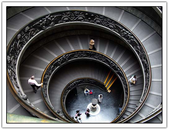
The staircase circular which gives it serenity and makes you think of infinity. Also giving you a calming feeling. 
This photograph has sharp, jagged angles and gives off a vibe of excitement and confusion.
This picture has balance and stability in it, it is also a small image in a large space so that your eye goes to some of the blank or empty spaces in the image. It also uses mostly lighter colors along with a dark section. The bottom section has a liquid texture to it to feel flowing.